 I took some time this morning to evaluate new "beta" product of Intuit - Financial Life for Mac. You can do this, too, if you have absolutely nothing to do. Otherwise, I suggest you to save some time for more interesting things. Intuit didn't show anything spectacular, yet.
First thing that I mentioned (and I don't know why it was the first one) is that why did they left importing utility (from Quicken for Mac data file) as a separate tool, but not integrated within their Import menu. What is Import supposed to mean then?
It starts a little bit faster than Quicken 2007 for Mac, although the overall navigation experience is worse. I'm running it on the latest MacBook Pro, so the good question now is - WTF, man? Lets go ahead though.
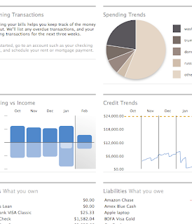
I was greeted with a pretty Scorecard, which started to be boring after few times of seeing it. The information layout seemed a little bit awkward for me - I couldn't find a good visual relationship between screen sections, but logically they look okay.
 The special importing utility didn't do a good job and couldn't import my scheduled transactions out of the Quicken file.
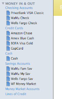
The next thing that surprises me every time I'm evaluating some financial software, is why the hell the left side bar never shows the current balance? Like, ($1,000) or +$5,000 or whatever your designers can come up with, but give the freaking numbers.
Isn't it something I might be happy to give a quick look and see without need to click anything? We're running the financial software which is all about numbers.
Intuit introduces tags instead of categories now.
Import tool fucked up again, and imported all categories, that used to be subcategories (you know, Quicken used to have the Category:Subcategory:... type of thing) as a separate tags, with no logic relationship.
And that's a really bad thing. It royally screws up the budget (it looks like it's disabled anyway).
Finally, I don't really care about how do you call them (either categories or tags), but who came with there stupid idea to show --split-- there?!
 It looks like the things are getting worse during the road. The screen is frozen every period of time. And sometimes it's not, but it looks to me like it's - I'm click on something, and I get no feedback for my click. As it comes up, the thing I'm clicking on is not clickable at all. (Sounds weird.)
Downloading transactions never worked for me. While it runs the show and simulates that it's doing something, I never was able to clear or reconcile transactions or even download new ones from the bank. (Quicken works well at the same time.)
Tag cloud - something that could be an impressive tool if placed properly. Unfortunately, I found it to be a part of reports, and to be able to see it, I need to navigate to the report, which shows only the tag cloud of categories (now tags).
As it was said, I found budgets disabled in my beta copy. From the other note, I found quick links to current and last month reports to be pretty useful, though having too formal output. (You need to get familiar with that, before being able to understand it from the first sight.)
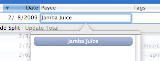
 Transactions - what is the transfer field? That's an absolute overload of the input, that is already overloaded. More on awkward selection of payment source - once I made the selection, why do you want me to see it twice on the screen, taking such a big box of empty space? What a waste.
I didn't find a good indication of future transactions (or upcoming, or planned, or whatever you call it) - the recorded transaction which is posted within the system, but is marked on some future date. The Quicken used to be kind of smart about such transactions, and provided with two balances: one, which is current, and another one, which will be on specific date.
I can continue this for a pretty long time, but that wasn't my intention. I already evaluated the major points of the system, that are critical or important for me. Resolution: didn't pass. Sorry, but this is not something I'm going to change Quicken for. I do have some complains about Quicken, but at least it's good with all these things.
Disclaimer: Please, remember, that my criticism is based on my personal expectations and standards of working with financial software. I'm not doing this professionally, and I don't want to, unless, I find it interesting. (Didn't find it so, yet.) So everything described here, could work well for you, your friend or someone else. But it is not a good fit me, or for someone who thinks and works in the same manner as I do.